IPL: Rating top 10 team logos of all time
Having more than 14 teams associated in the history of the IPL, and an endless count of variations and logos of the franchises, let's look at the top 10 of all time.
10 Min Read

The Indian Premier League (IPL) since its 18 years of establishment has seen innumerable changes. From witnessing new teams formulating, newer squads, teams getting banned, new liveries and even complete rebranding of the franchises, the league has seen plenty. Amidst all this, one thing that has remained common throughout is the creativity in designs amongst the teams that grows multifold year on year.
Several teams over the years have surprised the fans and followers of the sport by unveiling newer tones to the logo, a variation of the same logo and something like a revamp of the entire design. With each new logo, a newer message goes out to the stakeholders of the sport, forming a connection with the teams and the spectators.
More than 14 teams have been associated with the history of the IPL, and an endless count of variations and logos of the franchises.
Let us look at the top 10 IPL team logos of all time from MI, CSK to RCB & more:
10. Mumbai Indians (MI)– 6/10
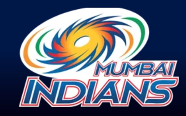
With a star-studded lineup, the Mumbai Indians franchise enter as one of the favourites in the tournament. The team has had a mysterious history of either winning the IPL each time they qualify for the playoffs (except in 2010) or ending out of the top four. The franchise has been the hub for emerging players and has had an incredible record of producing match winners of modern cricket. Just like their dashing performances, their logo is impressive too.
Mumbai Indians have been one of the teams that have made minor changes to its logos consistently. Providing variations of the same logo for the three years of the IPL, the Mumbai logo is simple yet classic. The logo consists of a spinning chakra (razor) known as the Sudarshan Chakra with highlights of the Indian tricolour. The idea behind keeping the razor was due to the initial idea of naming the team Mumbai Razors.
The franchise had a rough season in 2024 with Hardik Pandya being named as their new captain and the overall performance of the team also deteriorated.
Get every cricket updates! Follow Us:
Download Our App