IPL 2023: Ranking top 10 logos
A well-designed logo can create an emotional connection with fans and help establish a sense of community.
12 Min Read
3. Royal Challengers Bangalore (RCB)- {9/10}
The Royal Challengers Bangalore made their IPL debut in 2008 with a round logo and was used for the first seven years of the franchise in the tournament. At the top, a colossal crown made of silver, gold, and red color was positioned. The letter "RC" was written in the center and took up a significant amount of space. The name of the franchise was also included in black color on a golden frame around the logo.
In 2016, the franchise updated the logo with a more modern look by reducing the size of the letter "RC." The black color was used in the major regions of the logo. They replaced the crown with a golden lion in a black outline at the top of the logo. The name of the franchise was again written in the same font and size on the golden frame of the logo.
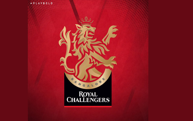
In 2020, the franchise unveiled a new logo and moved away from the circular shape. The new logo features a light gold lion positioned at the top, larger than the lion in the previous logo. The word "Bangalore" is written separately at the top in black, underneath the lion. The name "Royal Challengers" is written in white, on two levels, at the bottom of the logo, with a red underline. The new logo features a more modern and sleek design and uses a combination of gold, black, red, and white colors.
Get every cricket updates! Follow Us:
Download Our App