IPL: Rating top 10 team logos of all time
Having more than 14 teams associated in the history of the IPL, and an endless count of variations and logos of the franchises, let's look at the top 10 of all time.
10 Min Read
8. Rajasthan Royals (RR)– 7/10
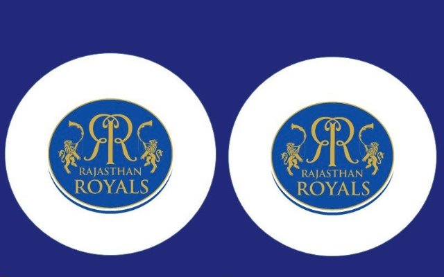
The Rajasthan Royals started their journey in the IPL on a majestic note by clinching the first edition trophy. Since then, the team has not found its way with luck, ending in the lower half of the table almost every season. Amidst their mediocre time, the classic RR logo has often been spoken about, especially the newest one.
Rajasthan would undoubtedly be the first state to come to any person’s mind when the word royalty comes up. Possessing a rich, royal history, the two inverted R’s in the Rajasthan team’s logo is self-explanatory. The crown on top of the inverted R’s represents the pride, power, triumph and glory the beautiful state is known to be. The pink backdrop not only signifies the feeling of love and kindness but also the state’s capital – Jaipur, known as the Pink City of India.
The recent RR franchise has been on the lines of their previous logo. Starting with their mascot lion named Moochu Singh on either side of the double R, the gold and blue logo gave a traditional royal look to the logo as opposed to the current pink. The team will look forward to producing the royal performance in the upcoming season and going one step ahead after making it to the final in the last edition. The logo receives a 7/10 rating.
Get every cricket updates! Follow Us:
Download Our App